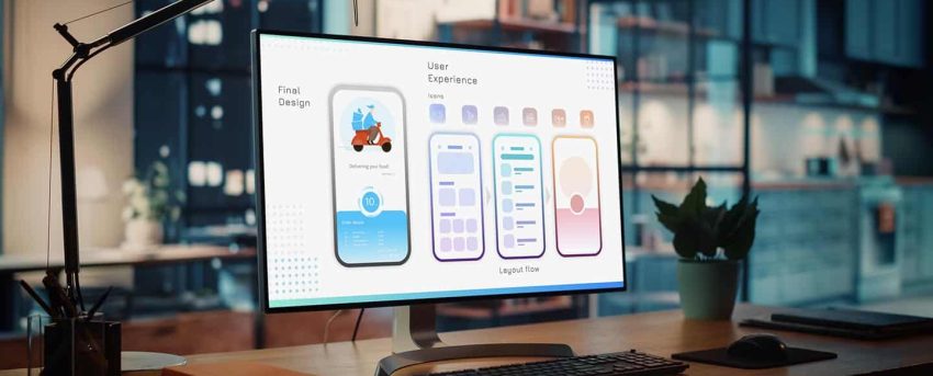
Responsive Elementor design is critical in 2025, as a beautiful website that doesn’t work on mobile is a broken website. With over 60% of web traffic coming from smartphones and tablets, responsive design isn’t optional—it’s a necessity. Elementor provides powerful tools to make your website look and feel perfect on every screen, but only if you use them correctly. At WP Support Lab, we help agencies and business owners build fully responsive WordPress websites with Elementor that convert seamlessly across all devices. Here are our 10 essential rules to ensure your site performs flawlessly every time.
Why Responsive Design Matters
Responsive design enhances user trust, boosts engagement, and improves conversions. A 2023 StatCounter report shows mobile devices account for 60.77% of global web traffic StatCounter, making mobile performance non-negotiable for SEO and user satisfaction.
🚀 Prioritizing responsive design is key to staying competitive.
10 Rules for Responsive Elementor Design
1. Start with Mobile in Mind
Many designers begin with desktop layouts, but a mobile-first design approach is smarter. Focus on mobile users’ needs: fast access, minimal distractions, and easy tap targets. Collapse complex structures into mobile-friendly components.
📱 We often start with the mobile wireframe first — then scale up.
2. Use Elementor’s Responsive Settings
Elementor simplifies responsive Elementor design with tools to adjust padding/margins, hide/show elements, and set custom font sizes per device. Use device preview toggles to customize each breakpoint, not just desktop.
🔧 Always test and tweak settings for every screen size.
3. Avoid Fixed Heights and Widths
Fixed dimensions break layouts on smaller screens. Use % or VW/VH for width/height, let content adapt fluidly, and opt for “Min Height” in sections instead of fixed heights.
💡 Flexibility = responsiveness.
4. Master Section and Column Layouts
Elementor’s structure (Sections → Rows/Columns → Inner Sections → Widgets) needs careful management. Use nested sections sparingly, reduce nesting for leaner code, and improve mobile performance.
🎯 Fewer sections = better mobile experience.
5. Use Elementor Flexbox Containers
Elementor flexbox containers offer easier alignment, fewer nested sections, better performance, and cleaner responsive behavior. Activate them via Elementor → Experiments → Container → Active. We use containers for all new builds at WP Support Lab.
🧪 Switch to flexbox for more efficient layouts.
6. Optimize Typography for Mobile
Text that’s elegant on desktop may be unreadable on mobile. Use typography for mobile with REM/EM units, set mobile-specific font sizes, and keep line lengths at 40–60 characters for readability.
📱 Bigger, bolder, and more scannable on mobile.
7. Reduce Image and Background Bloat
Large images or videos tank mobile speed. Use WebP images, replace backgrounds with colors/gradients on mobile, compress visuals, and lazy-load everything. Hide decorative sections for mobile users.
🚀 Speed = better UX and rankings.
8. Use Global Settings for Consistency
Set global colors, fonts, and spacing to ensure a consistent look across devices. This simplifies updates without adjusting each widget individually, saving time and maintaining uniformity.
9. Test Across Real Devices
Elementor’s preview isn’t enough. Test with Chrome DevTools, BrowserStack, or real devices (e.g., older iPhones or Android tablets). We never launch without a full mobile QA pass.
🎯 Real-world testing ensures accuracy.
10. Keep Mobile Experience Focused
On mobile, less is more. Collapse menus, use sticky CTAs, eliminate unnecessary animations, and ensure thumb-friendliness with mobile performance optimization. We simplify sections for mobile without losing impact.
💡 Focus on what mobile users need most.
Final Thoughts—Responsive Design Is Good Business
A responsive website builds user trust, increases engagement, and drives better conversions. With Elementor, you have the tools to create stunning responsive sites—using them strategically makes the difference.
👉 Need help designing a fully responsive Elementor site that loads fast and converts better? Talk to WP Support Lab and we’ll build it right — on every screen! Talk to WP Support Lab!


